 Recently, I had the chance to style a beautiful house located in the Macalester Groveland neighborhood of St. Paul Minnesota. It was one of those experiences that I knew I would love to experience and be a part. I felt it was a wonderful opportunity to “play” in a home with so much character and tell about it. This gem is a treasure that I could not imagine sharing with anyone else. I knew that you would all appreciate the way this family modernized and updated their home to suit their family’s needs, as well as how they added a two-story extension onto a beautiful 1924 beauty while maintaining its exterior aesthetics. Let’s get started!
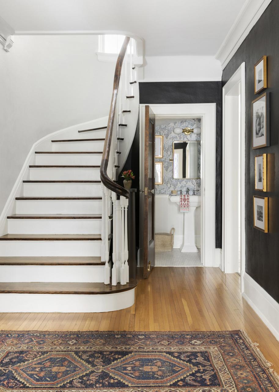
This beautiful, original staircase greets you as soon as you enter this home. As you can imagine, the homeowners had previously lived in a high-rise condominium located across the river from Minneapolis. Moving into this home was a big change. The homeowners told me that after they chose to work with JKath’s design, build and remodeling team, everything just clicked. This statement made me think about how important knowing your team is and feeling all the feelings are because you will go through some real feelings during the process. Trusting the process is important. It allows you and others to be able to give yourself some grace. Things happen, no matter how much experience or planning a project has. You can be flexible and adaptable as long as you’re working with a good team. This is what happened to this 1924 house, but we will get to that later. Are you ready to see a bit of the entryway before?
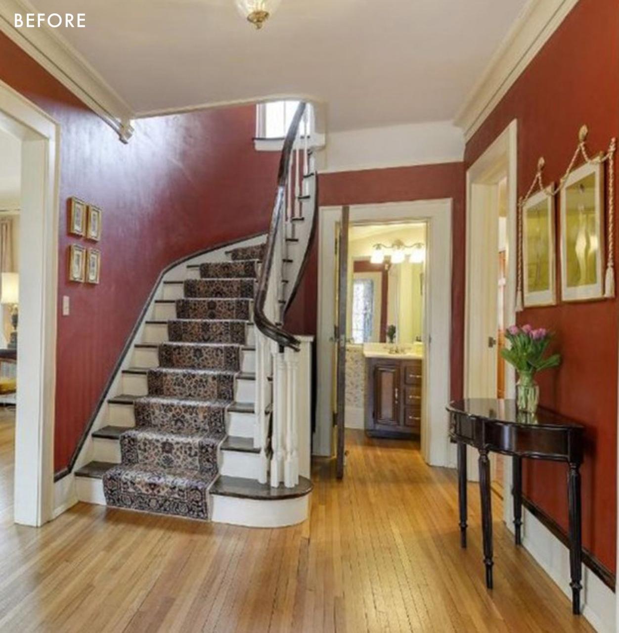
It’s not bad, is it? It’s amazing how they gave it a new look with just cosmetic changes. This is proof that paint can go a very long way.
Before I go into the kitchen, can we take a moment to look at this powder room?
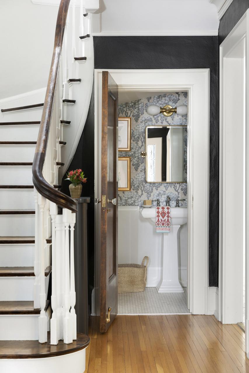
The space is small but full of personality. It’s a great idea to spend more on the powder room. Since it’s a smaller area, you won’t have to use as much material.
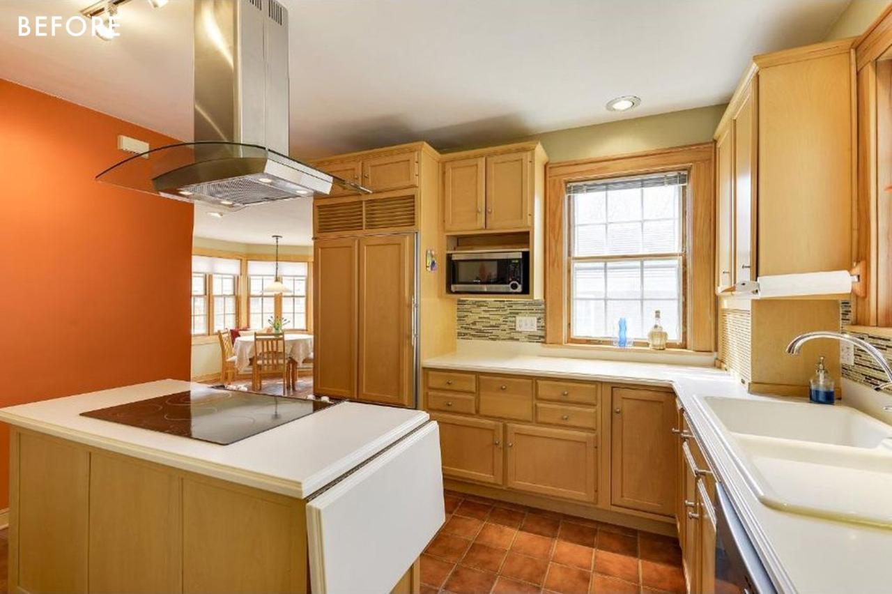
The homeowners knew that they would update the kitchen because it was so small and awkward. It also didn’t suit the family’s aesthetic or function. They debated how to remodel their kitchen while keeping the original footprint, which was equally difficult. The scope of the project changed, and a new design was created. The homeowners, who had complete faith in Jkath’s abilities, decided to build an addition onto their historic brick home. They did not make this decision lightly, as they wanted the addition to look like it had always been part of the house. To achieve this, the brick was installed on the outside of the addition to match the existing brick and the roof continued to be clay tiles to preserve the historic exterior. This new addition gave them more space to accommodate a larger kitchen, mudroom, and convert their small second-floor room into a large primary suite, complete with vaulted ceiling, bathroom, and walk-in wardrobe.
Are you ready to see the newly renovated kitchen?

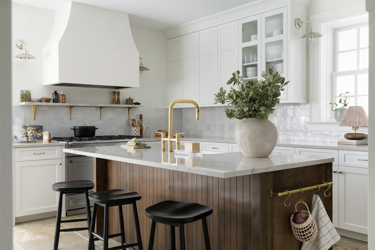
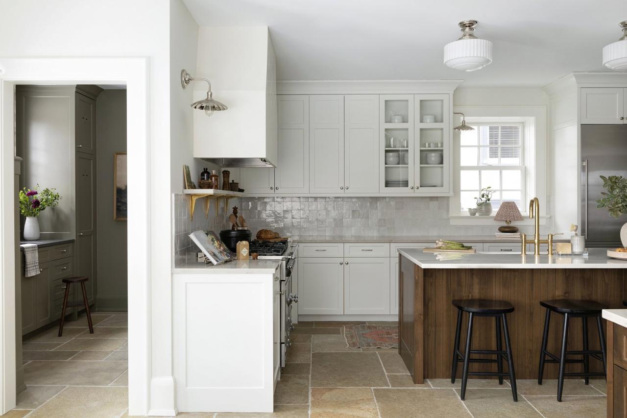
They wanted a white kitchen, but again, trusting the design team they chose a softer color for the perimeter with contrasting rich alder wood on an island with kerf panels. As I entered, I was immediately taken by the beautiful wood island and custom-framed and plastered ventilation hood.
The alder wood interiors of the cabinets are a great detail. I also love how they contrast the cream cabinetry and the sliding doors in the pantry. This is a great example of how details matter, particularly when making a big investment.
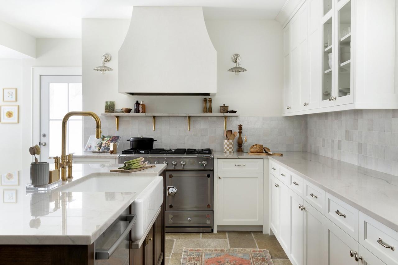
As I entered, I felt as if I were being hugged by a warm embrace (maybe literally because of the in-floor heater system that warmed my toes as I walked over these beautiful limestone pavers). These pavers were originally designed for outdoor use, but JKath researched them for indoor use. She reinforced the floor to support the stone’s weight.
I admire and love how they combined the unlacquered nickel with the polished brass hardware on the perimeter cabinetry and light fixtures. If this kitchen could not get any better, it’s because they restored and reused the existing cabinetry. The island and custom-built dining room hutch were both repurposed.
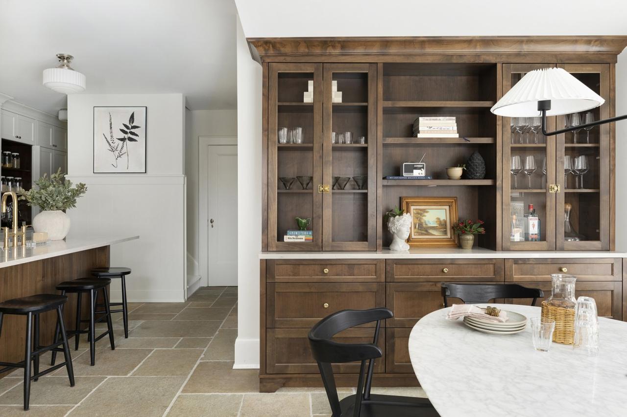
The homeowners debated whether to install a beverage fridge in the dining room or a coffee station, but decided to go with a custom piece of furniture. I am so glad they did, and even more importantly, the homeowners are also SO happy that they did. It really warms up the room and looks special, as it echoes both the interior of the cabinetry and the island.
As I mentioned before, the addition allowed them to create a full-sized laundry room! Before, you can see that this door led to the outside and there used to be a small cupboard next the kitchen:
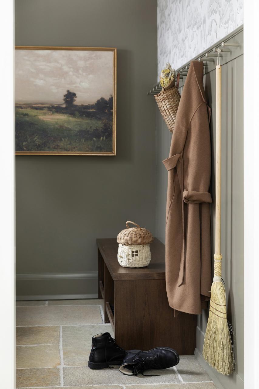
Tada! Now they have the perfect mudroom to store all their gear, including shoes, coats, and other items. I love the Larder Cabinet air vents. This is a very special feature that pays tribute to the house’s period. This is a trend EHD highlighted in its kitchen trends post earlier this year.
JKath custom-built the bench in Alder, with a finish that matches the wood tones of the kitchen.
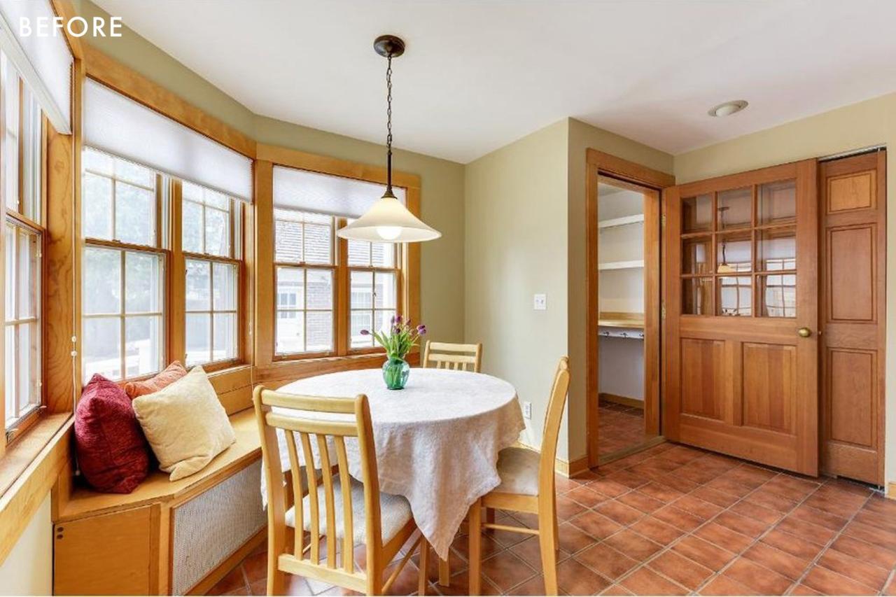
 I also love that they chose to install a beverage refrigerator here instead of the original idea of installing it in the dining area.
This hardworking area is given a new lease of life by the combination of beautiful wallpaper and moody green cabinetry. Never underestimate the usefulness of a peg rail. My brother-in law DIY’d for my bathroom, and I love it. This is why I love it. It’s a great example of how utilitarian spaces can still have a lot of personality.
The addition of the primary bedroom felt seamless. It was hard to tell what parts were original, and which ones were new. This was JKath’s goal, and they achieved it perfectly.
The homeowner’s bedroom was previously small, but after the addition they gained more space and vaulted the ceiling to visually make the room seem larger. They also added a walk-in wardrobe and a primary bathroom. The homeowners had also budgeted for central heating and air conditioning to be installed in the remodel. This also allowed them more space.
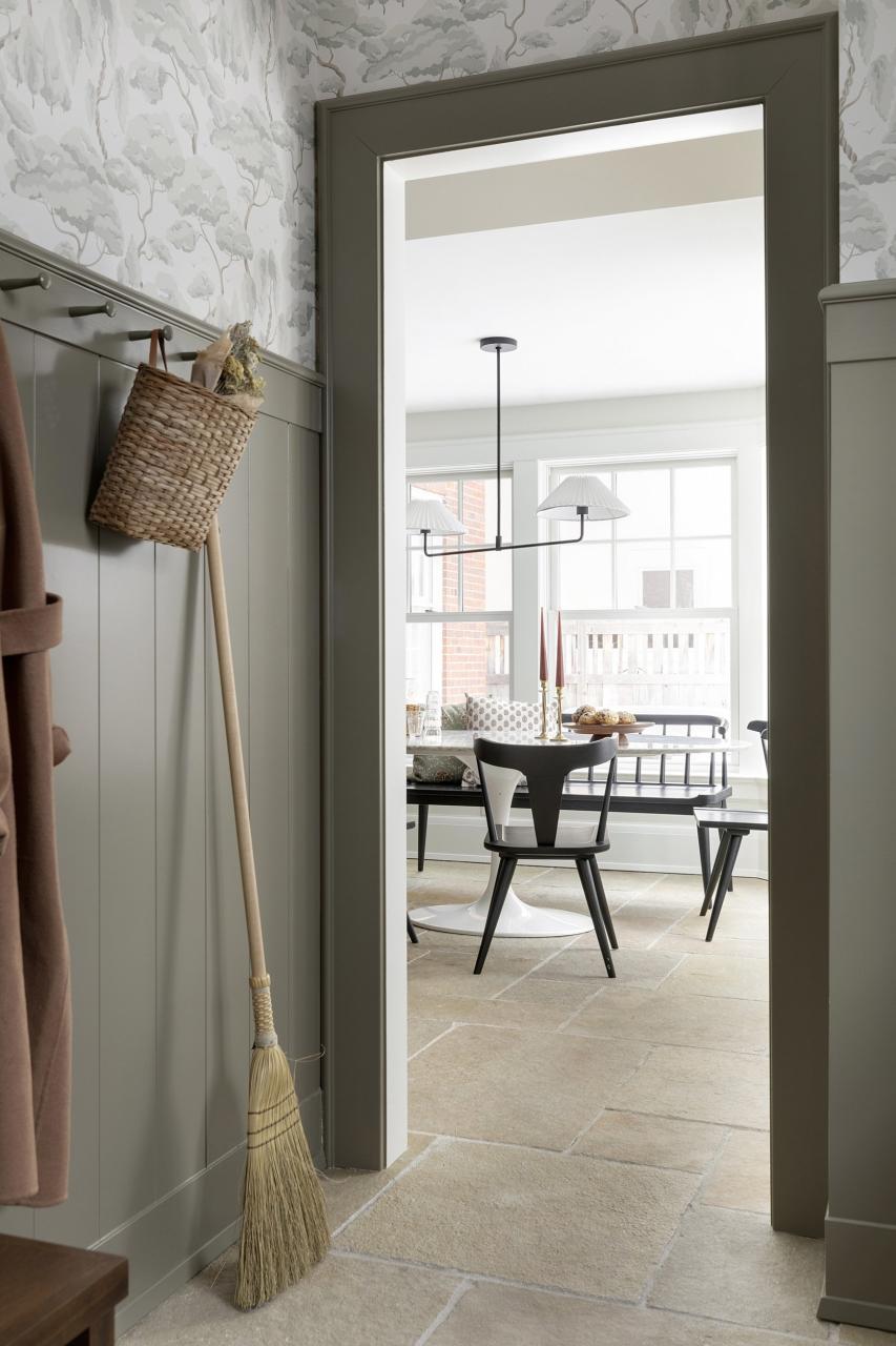
It is important to choose a ceiling and trim color that are softly contrasting. This will help to instantly create a cozy atmosphere, which makes it seem less “new”. A simple, but effective detail.
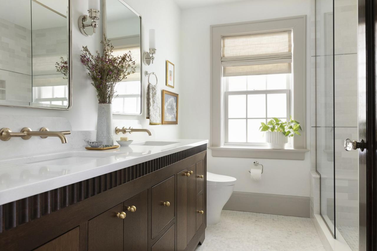
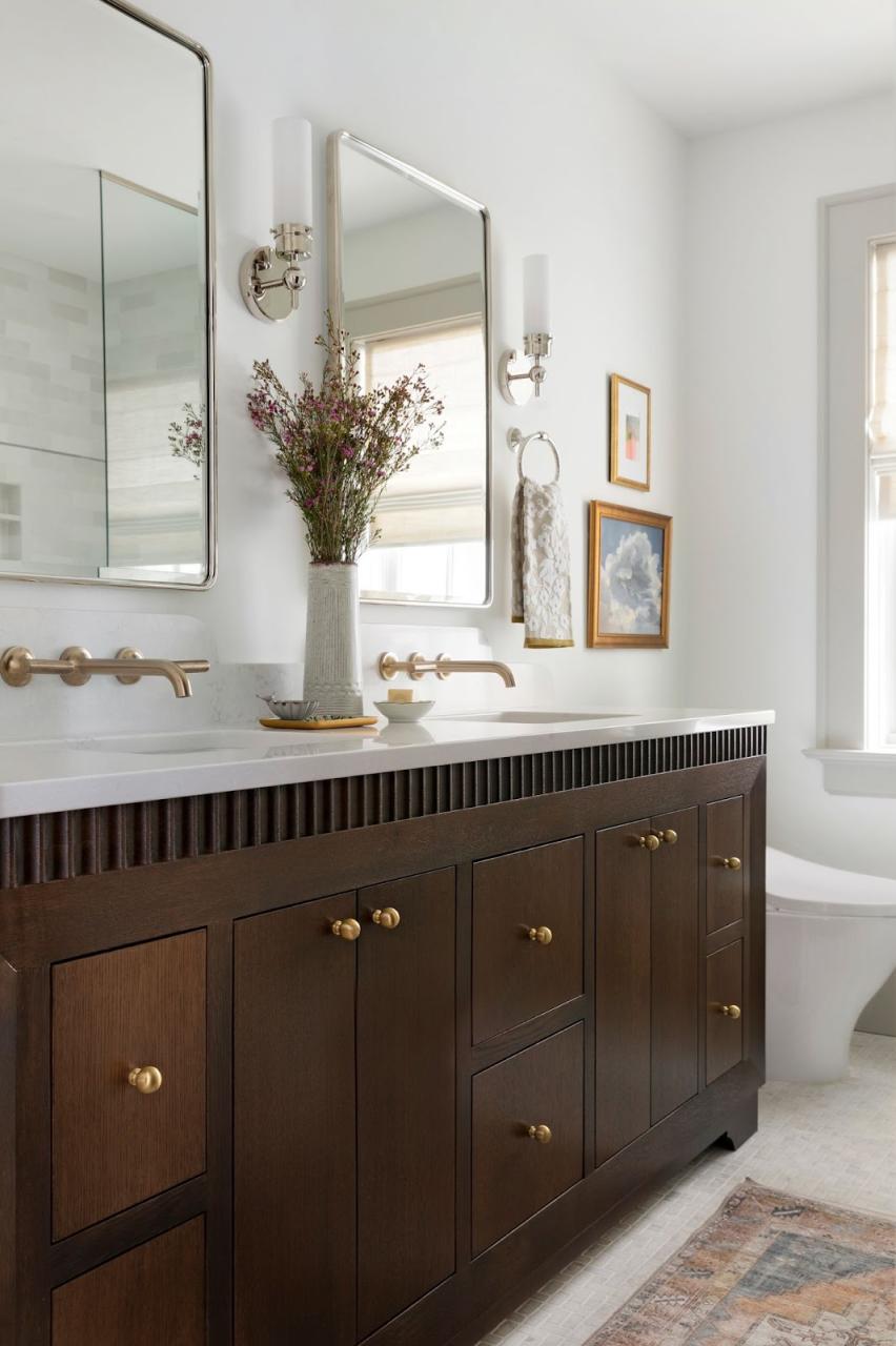
Could we please talk about their bathroom vanity that was custom made? I was blown away by the scalloped details and beveled profiles. JKath’s in-house custom cabinetry team was on point! It makes the homeowners’ primary bathroom feel luxurious and special. I mean…
They did it again! Also, take note of the beautifully curved back splash. Swoon!
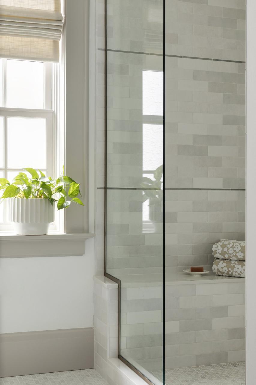
The tile color was chosen because it matched the trim stone color. The tiles are cohesive, but visually interesting because they have a variety of colors.
After the event, I asked homeowners what home meant to them. “Our home represents the ultimate safe place for our family.” It’s where we can be with each other or spend some time alone. It’s also a place to rest and play. We love inviting friends and family over to eat and enjoy the company.
They have a perfect home that will serve their family well for many years.



Leave a Reply